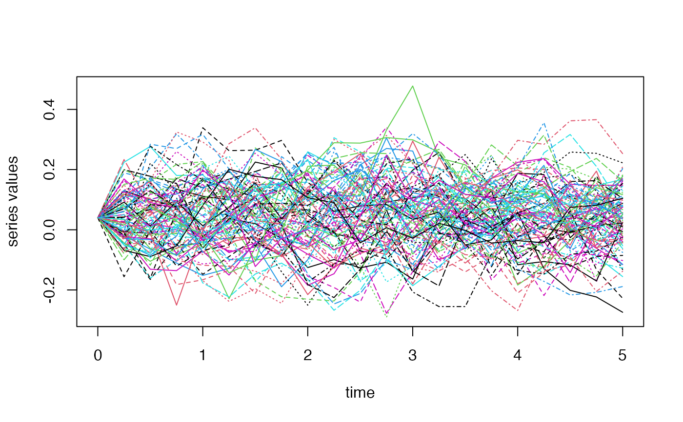
Creates a plot showing time series data with confidence intervals, percentiles, and mean values.
esgplotbands(x, ...)Arguments
Value
A plot object
Details
The function creates a plot with:
Mean values as the central line
95th and 5th percentiles as outer bands
Upper and lower quartiles as inner bands
Confidence intervals based on t-tests
The plot uses a color gradient from light yellow to light green for the different bands.