Plot Prediction Interval With Optional Past Observations
plot_prediction_interval.RdThis function creates a time series plot showing prediction intervals, including optional past observations. The forecast is visualized with a confidence interval band and mean prediction line.
plot_prediction_interval(
  mean_pred,
  lower_pred,
  upper_pred,
  col_past = "black",
  col_mean = "red",
  col_future = "blue",
  col_ci = rgb(0.8, 0.8, 0.8, 0.5),
  legend_position = "topleft",
  x_past = NULL,
  x_future = NULL,
  ...
)
Arguments
- mean_pred
Numeric vector of mean forecasted values. Required.
- lower_pred
Numeric vector of lower bounds of the prediction interval. Required.
- upper_pred
Numeric vector of upper bounds of the prediction interval. Required.
- col_past
Color for past observations. Default is `"black"`.
- col_mean
Color for the mean forecast line. Default is `"red"`.
- col_future
Color for true future value. Default is `"blue"`.
- col_ci
Color for the confidence interval polygon. Default is `rgb(0.8, 0.8, 0.8, 0.5)`.
- legend_position
Position of the legend. Passed to the `legend()` function. Default is `"topleft"`.
- x_past
Numeric vector of past observations. If `NULL`, the plot will contain only forecasted values. Default is `NULL`.
- x_future
Numeric vector of future observations.
- ...
Additional arguments passed to the `plot()` function.
Value
No return value. Called for side effects (generates a plot).
Examples
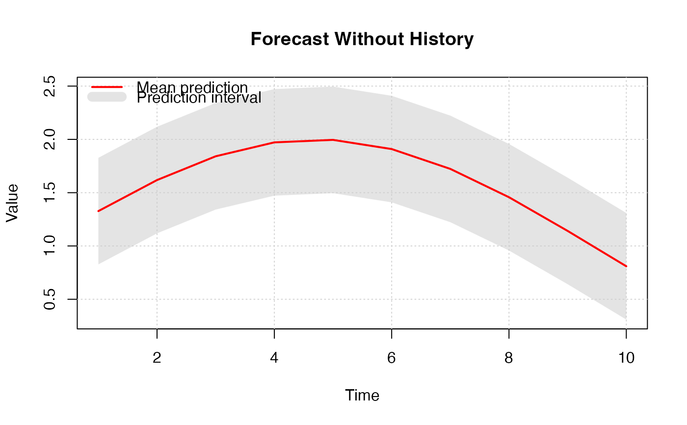
# Without past observations:
plot_prediction_interval(
mean_pred = sin(1:10/3) + 1,
lower_pred = sin(1:10/3) + 1 - 0.5,
upper_pred = sin(1:10/3) + 1 + 0.5,
main = "Forecast Without History"
)
 # With past observations:
plot_prediction_interval(
x_past = sin(1:20/6),
mean_pred = sin(21:30/6) + 0.1 * (1:10),
lower_pred = sin(21:30/6) + 0.1 * (1:10) - 0.3,
upper_pred = sin(21:30/6) + 0.1 * (1:10) + 0.3,
main = "Forecast With History"
)
# With past observations:
plot_prediction_interval(
x_past = sin(1:20/6),
mean_pred = sin(21:30/6) + 0.1 * (1:10),
lower_pred = sin(21:30/6) + 0.1 * (1:10) - 0.3,
upper_pred = sin(21:30/6) + 0.1 * (1:10) + 0.3,
main = "Forecast With History"
)
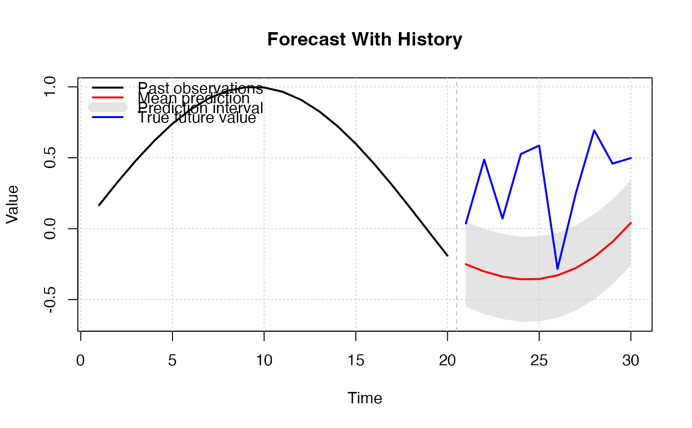
 # With past observations:
set.seed(123)
mean_pred <- sin(21:30/6) + 0.1 * (1:10)
plot_prediction_interval(
x_past = sin(1:20/6),
mean_pred = mean_pred,
x_future = mean_pred + runif(length(mean_pred)),
lower_pred = sin(21:30/6) + 0.1 * (1:10) - 0.3,
upper_pred = sin(21:30/6) + 0.1 * (1:10) + 0.3,
main = "Forecast With History"
)
# With past observations:
set.seed(123)
mean_pred <- sin(21:30/6) + 0.1 * (1:10)
plot_prediction_interval(
x_past = sin(1:20/6),
mean_pred = mean_pred,
x_future = mean_pred + runif(length(mean_pred)),
lower_pred = sin(21:30/6) + 0.1 * (1:10) - 0.3,
upper_pred = sin(21:30/6) + 0.1 * (1:10) + 0.3,
main = "Forecast With History"
)